01 | Home
We really focused on creating as streamlined a reading experience as possible, starting with a constantly updating, flexible hero module that could accommodate more or fewer editorially curated stories of varying hierarchy, as well as a dynamically populated trending block, ensuring the page always led with the biggest stories. This transitioned immediately into a clean blog roll, with editors able to give greater visual weight to the most important news or in-depth features. The feed was punctuated at regular intervals by modules teasing out the latest from each top-level category or other relevant curated content. Tags remained in a left column throughout, so users could intuitively filter by topic at any point. The right column then housed persistent promotion for top franchises, live event coverage and other key priorities.
02 | Article Categories
Users could access top-level category pages via the main navigation. Article category pages followed the home page layout, filtered by topic or vertical, and color-coded to clearly delineate category feeds from each other and visually connect modules of a given category across the site.
03 | Media
We developed a bespoke layout for each media page to best serve individual content types, with a unified organizing principle – hero real estate was reconfigured to give maximum impact to the latest and most relevant, with content then organized into blocks by topic, type, franchise or other curated category, each of which, like feed modules, easily expanded to an extended list view.
04 | Articles
A lot of thinking went into building a robust article viewing experience, including a series of custom layouts for media-centric or otherwise templated article formats, as well as a host of modular features that could be integrated as needed.
05 | Search
The search interface was obviously a critical component of the site’s functionality given the volume of daily news output and often specific nature of fans’ interest, complicated by having to straddle the now merged news and programming promotion components. We toyed with a series of filters and targeted programming-related modules, settling finally on a simplified layout with article, tag and SYFY Shows blocks. The retro console aesthetic, which I loved, also unfortunately didn’t make the cut.
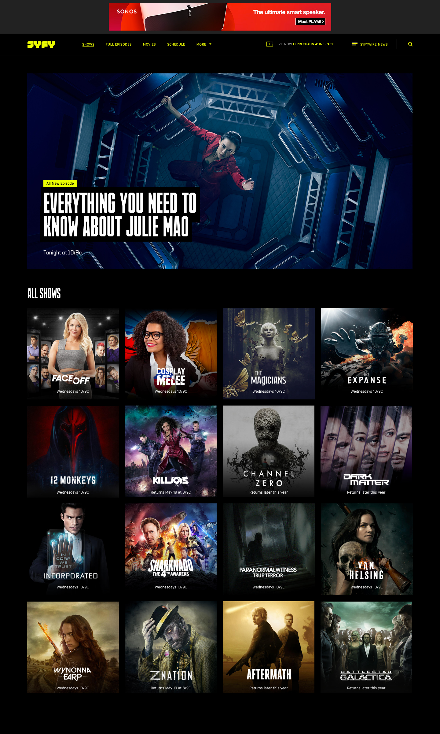
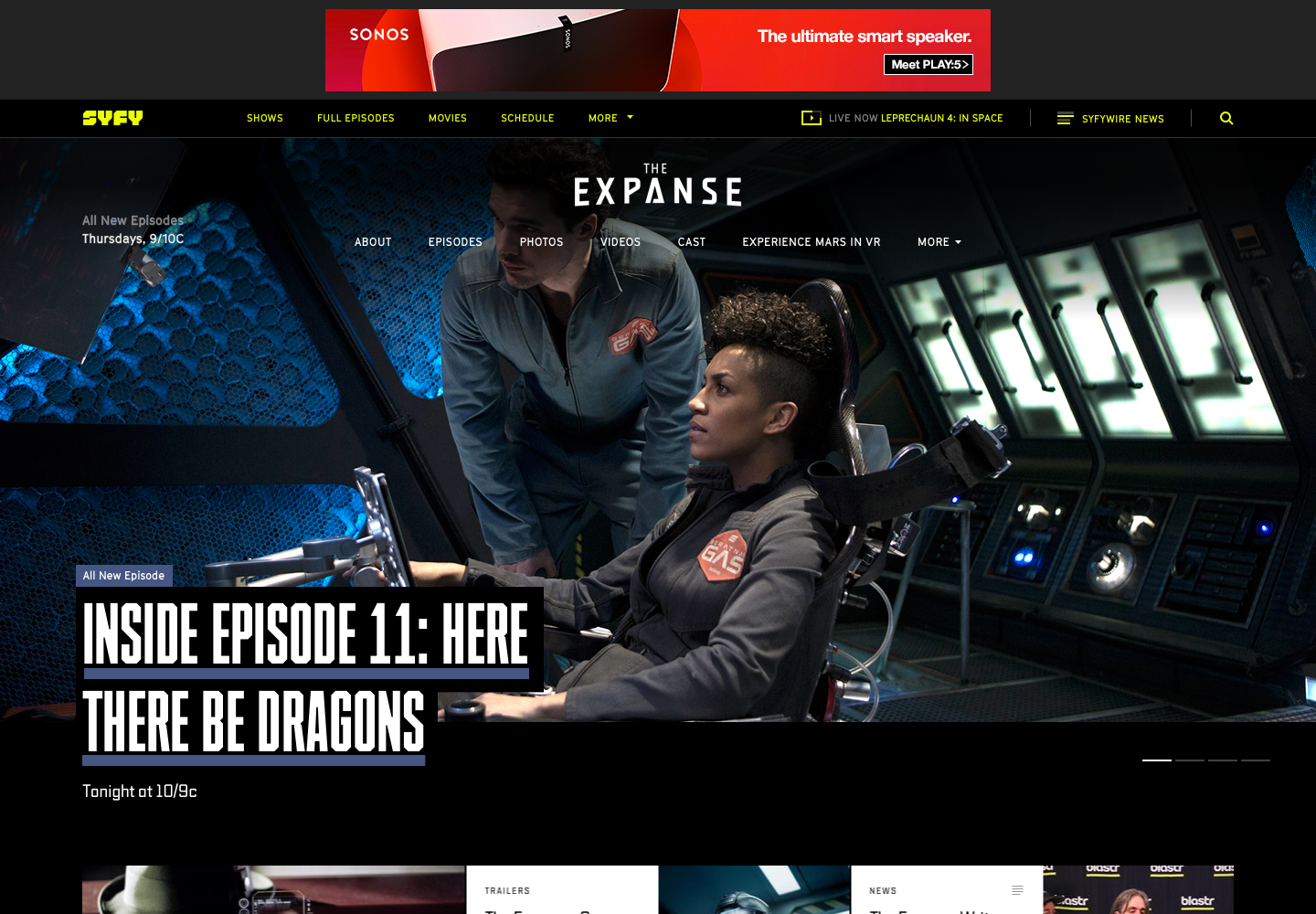
06 | SYFY Shows
Aside from the full redesign of SYFY WIRE, we also visually updated, and made a series of small functionality upgrades to, the network programming portion of the site. With news now being the home experience, SYFY Shows became a vital jumping off point for programming content and so needed to clearly guide users to the latest full episodes and other top-level priorities. Individual show sites and other key sections needed some additional thinking as well to incorporate a new typographical hierarchy and reenvisioned main navigation.
Recognition
Promax Awards 2018
Bronze, Channel/Station/Platform Website
Cablefax Awards 2017
2nd Place, Overall Website, Network (Large)
2nd Place, Website Redesign


