01 | Introduction
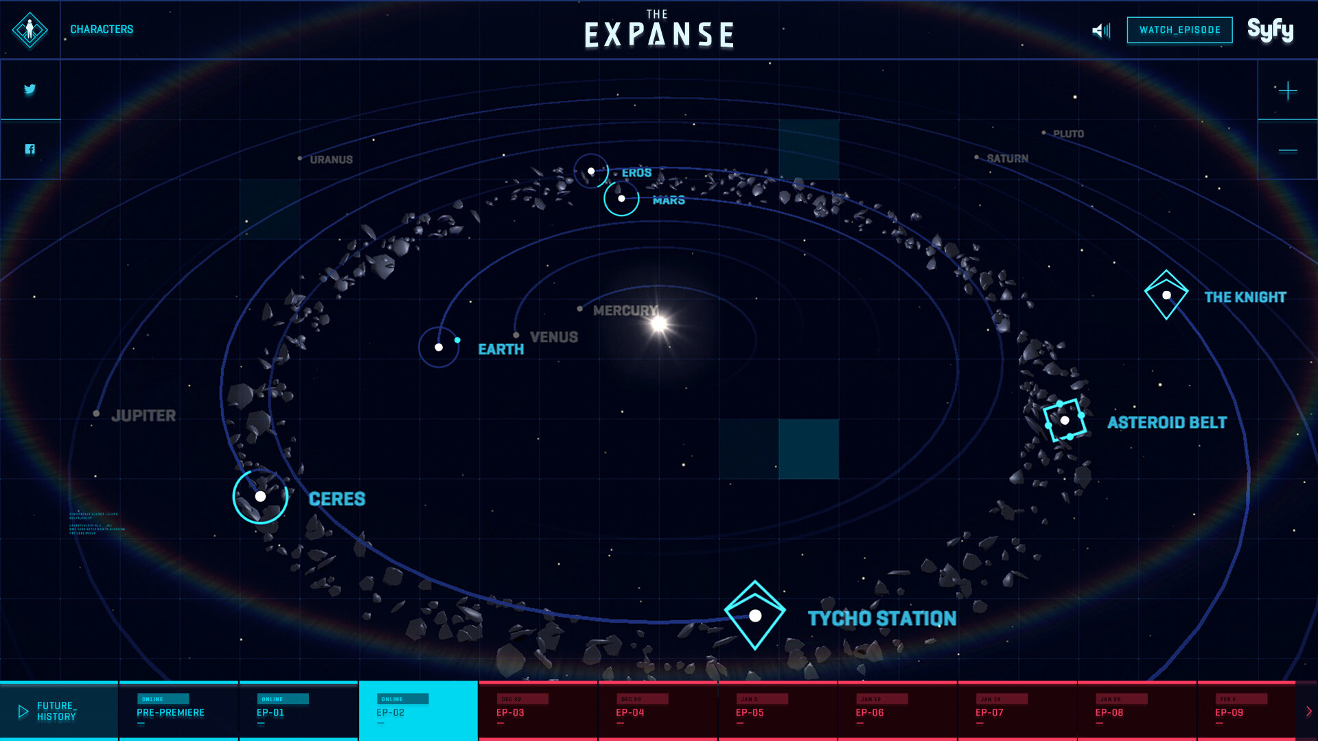
A splash screen teasing the experience appears on launch, followed by a video sequence detailing the backstory of the near-future world of the show that ends with a 3D view of the solar system users could spin and zoom to navigate. They could then click into the planets, asteroids, stations and ships that were the setting of the show to learn more.
02 | Navigating the Experience
Pre-premiere, users could explore the interface, getting background on the show’s various locations, organizations and characters. Then with each episode, pieces would change location on the map to reflect events and users could navigate by character to follow their progression or by episode to see who was where when.
03 | The Disappearance of Julie Mao
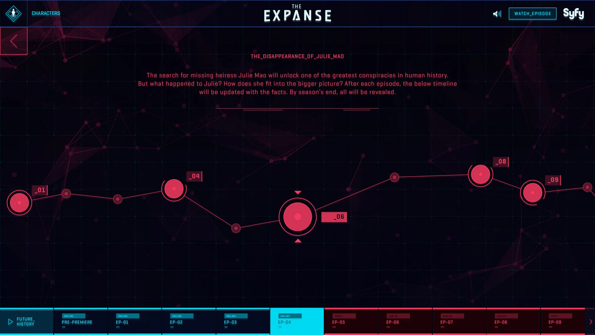
Hidden among the many moving pieces in the interactive solar system were clues to the whereabouts of Julie Mao, whose disappearance was the central mystery of Season 1. Clues contained information not revealed in episodes and more appeared as the season went along, so fans who visited the site regularly could piece together whole new elements of the narrative.
Recognition
Promax Awards 2018
Silver, Program Promotion Website
W3 Awards 2017
2x Gold – User Interface, Website | Visual Design (Function), Mobile Site or App
6x Silver – User Experience, Website | Structure and Navigation, Website | Visual Design (Aesthetic), Website | User Experience, Mobile Site or App | User Interface, Mobile Site or App | Visual Design (Aesthetic), Mobile Site or App
Cablefax Awards 2016
Finalist, Marketing of a Continuing Series
Shorty Awards 2016
Gold, Art Direction
W3 Awards 2016
5x Gold – Television Website | User Experience, Website | User Interface, Website | User Interface, Mobile Site or App | Visual Design (Aesthetic), Mobile Site or App
4x Silver – Structure and Navigation, Website | Visual Design (Aesthetic), Website | Video or Motion Graphics, Website | Visual Design (Function), Mobile Site or App


